Design system
A visual reference for people, paired with Markdown rules for AI-assisted implementation.
Explore the design system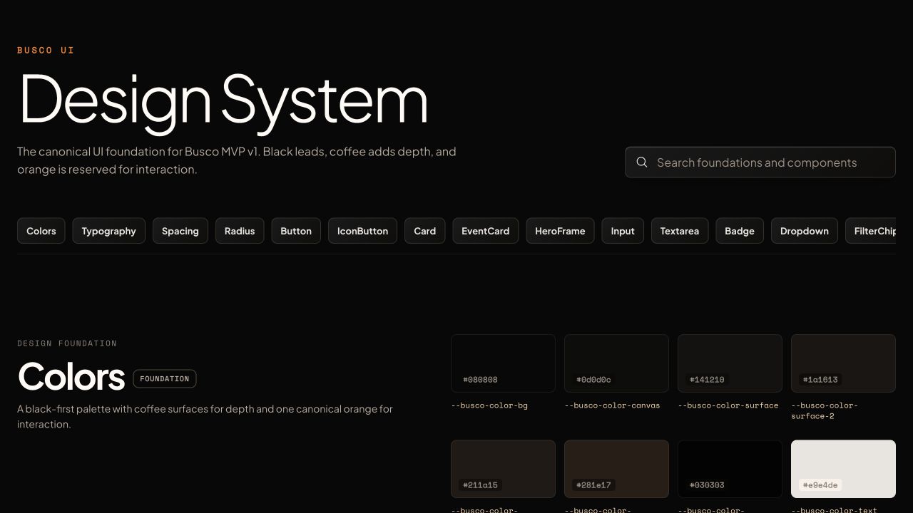
How an Event page request became a clearer web strategy, a working website, and a reusable design system.
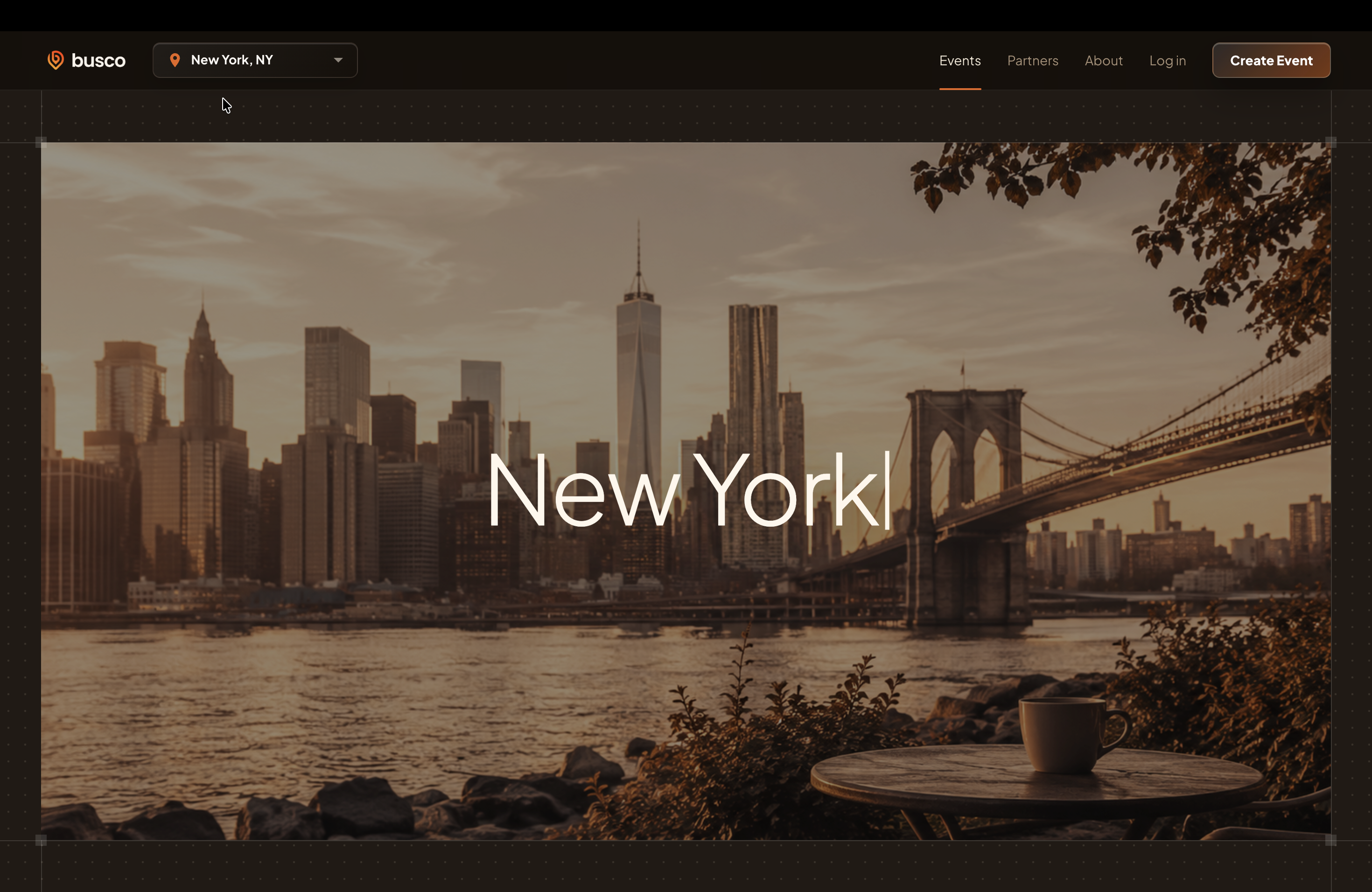
Busco is a Virginia-based startup for finding local events. It licenses its platform to schools and governments so student and community organizations can host events.
My initial task was to bring the app’s Event page to the web. The existing one-page website mixed messaging for institutional buyers and everyday users, but did not let visitors browse events.
When I reviewed the site, I saw two audiences sharing one page: people looking for local events, and schools or governments considering Busco for their communities. One needed to browse events; the other needed to understand the platform’s value.
Simply adding the app’s Event page would leave those different needs mixed together. Before designing the page, I brought a broader question to the CEO: what should each visitor be able to do on the website, and how should that differ from the app?
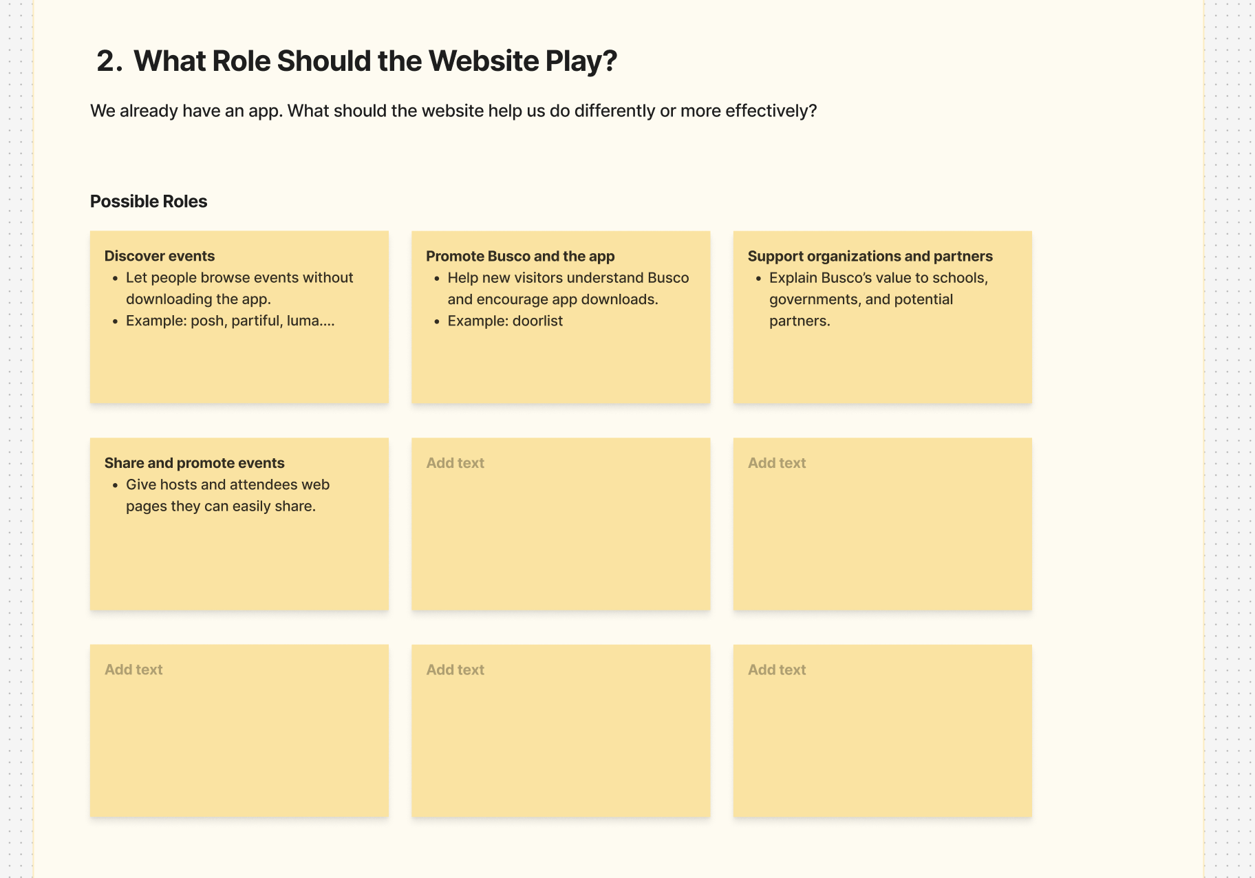
I worked with the CEO to clarify how web and mobile should complement each other. They should feel like the same product family, but web did not need every app feature. A shared purpose could lead to different features or different presentations of the same feature.
The old page mixed consumer and institutional messaging. I made event discovery the landing experience, with separate destinations for partners and product information.
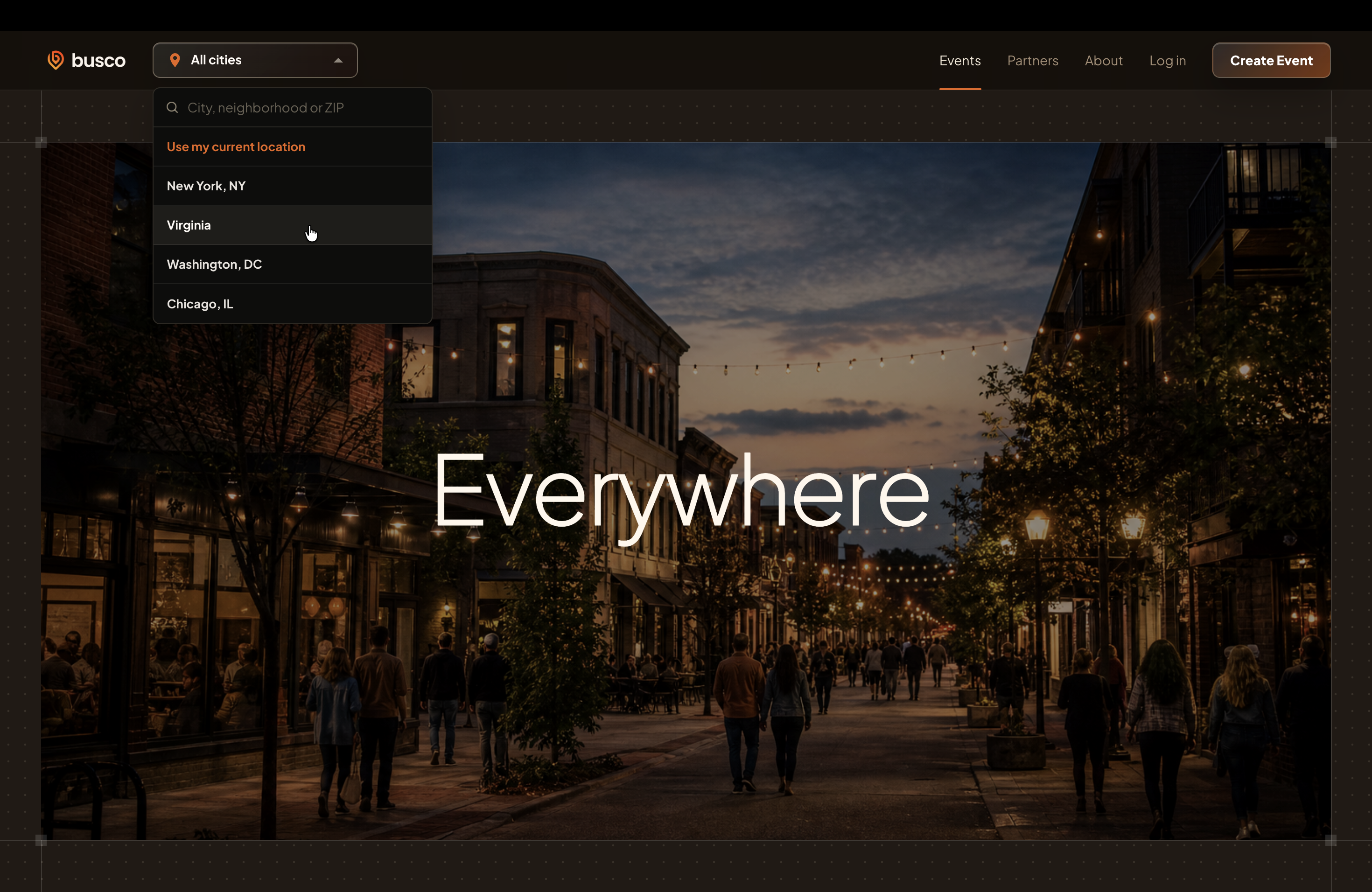
The app accessed the user’s location, but event coverage was still limited. Asking for location immediately on web could leave a new visitor with no results.
I chose to show all events first, with a few cities that had more events available to select. Visitors could explore what existed before narrowing by city.
I used Codex and Claude Code to explore visual styles and interactions in working prototypes. I defined and refined the new visual direction directly in code, without using Figma.
Because I was defining a new visual style, I needed a record that people and AI could both use. As the rules grew, organizing the documents became part of the design work: keeping guidance easy to find and maintain, rather than letting it become one long prompt.
When I moved the work into Lovable, those references helped keep new pages consistent with the direction I had established.
A visual reference for people, paired with Markdown rules for AI-assisted implementation.
Explore the design systemAn event-first website with distinct Events, Partners, and About destinations, implemented in Lovable using the shared design rules.
View the live website The live product may have evolved since this work.Ask first-time visitors to find an event and explain their next step. Observe task completion, hesitation, and empty results to check whether the new structure and discovery flow help. These are proposed checks, not measured outcomes.